

If you follow Apple news, you’ve seen Liquid Glass, the visual language shipping with iOS 26. It was Apple’s biggest design overhaul since iOS 7, touching basically every surface of the OS: navigation bars, tab bars, sheets, context menus…
We’ve been working on updating Pocket Casts for it. Here’s a bit of the thinking behind our approach, and what’s changed in our iOS app in version 8.13.
Why we follow the platform’s design language
Our design philosophy has always been to stay close to the platform’s native patterns. When an app speaks the same visual language as the platform (iOS in this case), users don’t have to relearn a lot. It also lets us move faster: spending less time reinventing standard UI and more time on the things that make Pocket Casts useful.
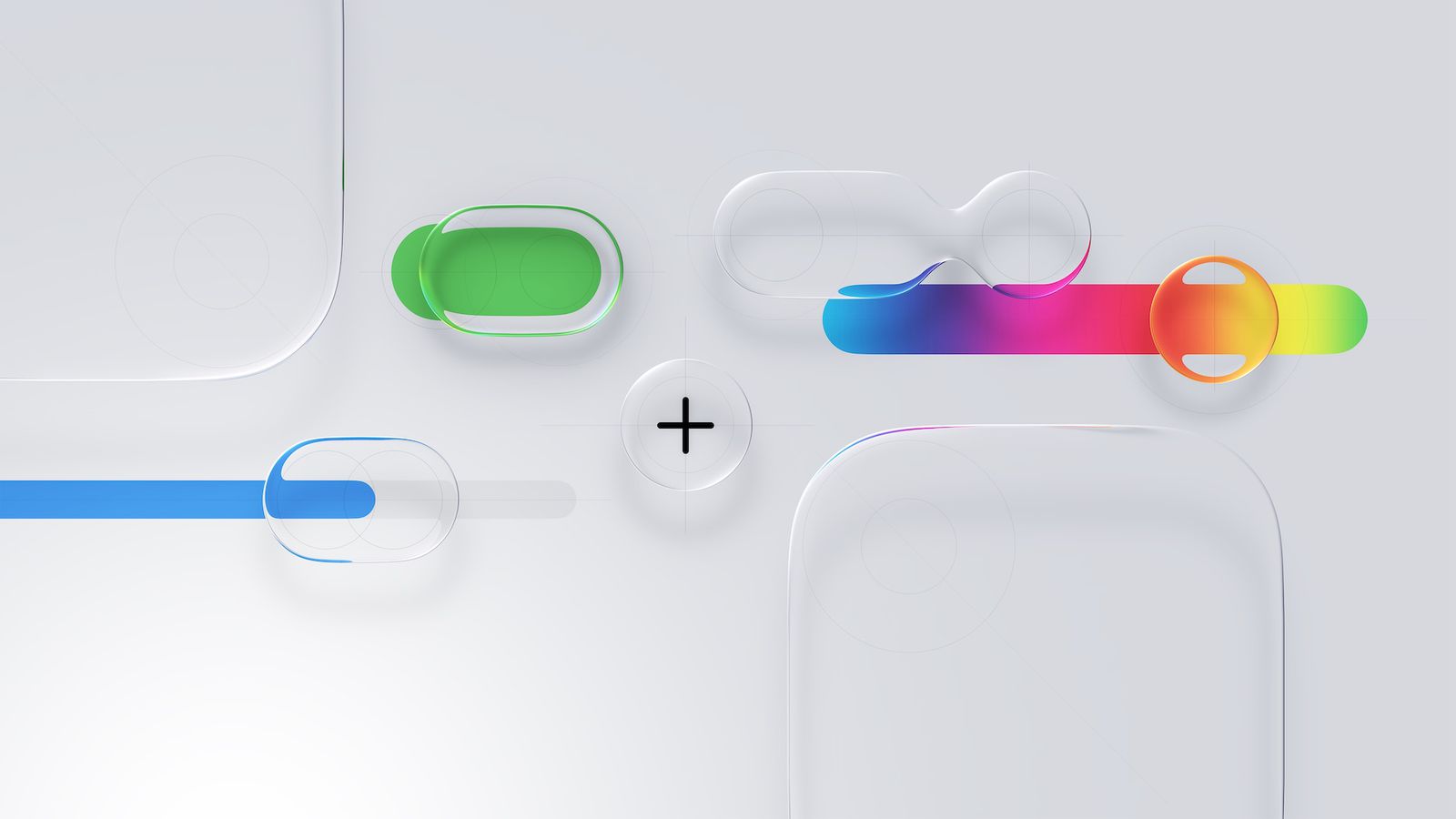
What is Liquid Glass?
Liquid Glass is more than a coat of paint. It’s a material system: translucent, adaptive UI elements that respond to light, content, and context. Controls float over the content rather than sitting rigidly above it.
The goal of this visual language is that interface controls recede so content stays primary. That’s something that speaks to us: Pocket Casts is all about podcasts and episodes, the UI is the frame that helps you interact with them.
What’s changed in Pocket Casts for iOS
Navigation is the same, but the tab bar now follows the Liquid Glass visual language. Scroll views extend underneath it, with the bar floating over content as glass.
The mini player is now a Liquid Glass accessory attached to the tab bar. The system handles the glass material and safe area, and it collapses together with the tab bar as you scroll, giving more space for browsing. It now shows the episode title and exact time remaining.
The Up Next tab icon is drawn at runtime with the queue count knocked out of a glass capsule, so it tints like any other tab and updates live. Adding an episode plays a small animation where the artwork gets pulled down into the tab.
During multi-select, the tab bar and mini player now hide, giving the selection footer the full bottom of the screen, a meaningful improvement in usable vertical space.
Other changes: confirmations that used custom dialogs now use native system alerts for more clarity. Various action lists now present as native sheets instead of custom bottom cards, responding faster and showing a more familiar interface.
What’s next
As always, your feedback shapes what comes next, so keep it coming! We hope you enjoy these changes and thank you for using Pocket Casts!